DESIGN PRINCIPLES - TASK 1: EXPLORATION
![]()
Week 1-3
Felice lee (0381272)
Design Principles / Bachelor of Design (Hons) in Creative Media - Taylor University
TABLE OF CONTENT
INSTRUCTION
LECTURES - Elements of design
Elements of design are the basic building blocks that's used to create composition and design in art.
- Point : Just a small dot, but when grouped together, it could create pattern, texture , or shape.
- Line : A stroke that connects 2 points. can be straight, curved, thick, thin, or implied.
- Shape : A 2 dimensional object, closed space, like circles, squares, or any abstract shape.
- Form : A 3 dimensional object that has depth, like pyramid, sphere, cubes.
- Texture : The way a surface look or see (rough, soft, smooth)
- Space : Is the area around, between, or within objects. Helps create balance, depth, and focus in design. Consisting : positive space (the main subject or object) & negative space (empty or background area).
- Colour : Something what we see when light reflects off an abject. It's used to set the mood and feeling of a design. Bright color (cheerful & energetic), Darker color (calm & serious), Warm color (warmth & excitement).

REFLECTIVE WRITING - Principle of Design
-Gestalt Theory is about how our brains automatically group things together and create patterns to help us understand what we see, which focus on organizing and structing visual information. There are six individual principles commonly associated with gestalt theory :
- Similarity : In gestalt theory, things that look alike whether by color, shape or size, are seen as connected, even when they are not close to each other. It makes part of a design ties together. Example of similarity principle in design is a set of park icons thats made by me, including flower, trees, human, bicycle, pet, trash bin, and duck, all designed with the same theme Glassmorphism style following with blueish color. By applying a consistent Glassmorphism style with a bluiesh hue, i noticed that, despite depicting different objects, the consistency in color and style allowed these icons to be found as a related group. This experience shows me how similarity can unify diverse elements in design.

Park icons designed by me
Diversity of similaritypicture source (here) , picture address (here)

- Continuation : The law of continuity says that our eyes naturally follow the smoothest part when looking at lines, i observed that when items were aligned in a line such in website sliders, viewer eyes naturally follow one item to next. This makes me realize that i could guide someone's attention or focus in my design with this method in my design.
Align product lists screenshoted from the amazon webContinuation
.png)

- Closure : is the idea when our brain naturally fill in the missing part of a visual to make it whole. Its like seeing a complete visual in a broken or incomplete image. It helps me understand the incomplete information by completing the picture myself. An example I analyze is the World Wildlife Fund's panda logo, where a certain part of the panda are intentionally erased. Yet my brain effortlessly fill in the gaps, recognizing it as a panda. This made me realized how implying a certain elements in a design can engage and draw the audience imagination. Besides logos and images, closure can also applies to reading and our language processing. I've noticed when it comes to typos, my brain can automatically understand the meaning and fixing the words. Its because our brain are linked to familiar patterns. For example, "Tihs is an eaxmpel of closure". Even though the words were typed messily, I can still understand it and read it as "This is an example of closure".
WWF LOGO

- Proximity : is how objects are placed close together or far apart. I realized when items are group together, my brains see them as related. For instance, if circles were put close to each other, people will think they belong together. But if u space them out, it separates them even when they look the same. This approach is commonly used in UX design, which helps us to organize things without having to use border or lines by grouping. Example , separating the good examples together and bad examples separately. From that, users can easily understand and compare information, making the content easy to read.
Proximity

UX design

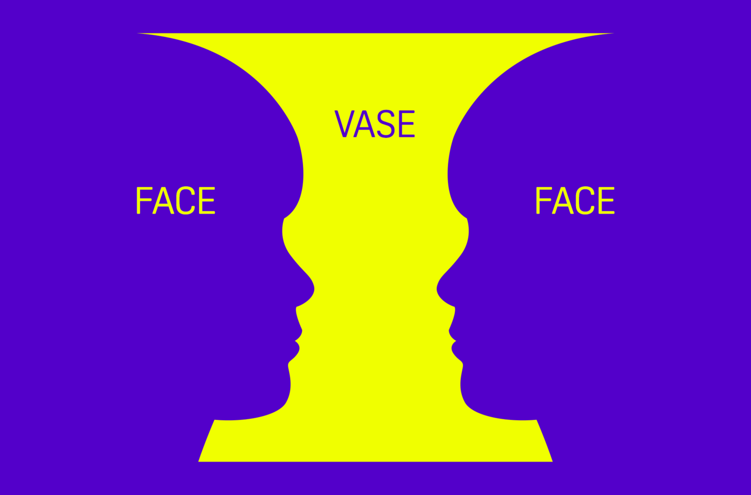
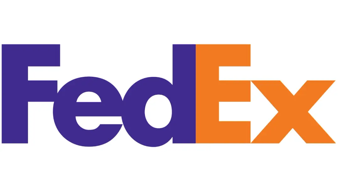
- Figure or Ground : is a principle of how our brains separate main subject (figure) from the background. Focusing on what stands out while seeing everything else as background. For example an observation that I made from an optical illusions named Rubin's Vase. When observing this illusions, peoples see different shapes at first either a vase in the center or two faces profile. What's interesting is that our eye and brain can easily decides automatically which part is the figure and which is the background. If u choose vase as the background, the 2 faces will be your object and the first thing u see. But if its the faces that's as the background, u will see the vase in the first glance as your object. Similar to the FedEx logo, which use this principle to show the hidden arrow between the space of E and X. This principle helps create clear focus and visual to our eyes, making it easy for people to understand what they look.
Rubin's Vase illusionFedEx logo


- Symmetry and Order : The law of symmetry and order means that or brains like to see things in a simple and organized way, which means that our brain are naturally into something balance and harmony. I realized when I look at complex or overlapping shapes, my mind naturally try to understand them in the easiest or simple way. This principle applies to the logo of the monochrome olympic. At first glance, our brain might just see it as a random curve line, but then my brain naturally process those visuals as overlapping circles. This principles show us how powerful our view in organizing visual information effortlessly. With this principle, we can guide viewers to process information more intuitively.
Monochrome Olympic logoinformation above (Gestalt Theory until symmetry and order) source : here

- Contrast in shape : Contrast between shapes can be easily recognized by the difference characteristic, example: spiky and smooth surface elements.

- Contrast in color : Even though some elements have the same shape, there are still differences in tone and color. Darker colors and tones are used to draw more attention, while the lighter in reverse.

- Contrast in scale : Scales could easily help us spot the differences between similar elements that appears bigger or smaller than the others, making us realize something unusual in a group or pattern.

- Contrast in layout : This principle steals my attention by element arrangement, instead of placing everything in neat and structured way, we could create something different and eye-catching by arranging elements freely or in unexpected ways.

- Contrast in type : Is usually used to show the differences of the text such from sizes, color, typography (bold, italic, fonts), spacing & elements. There are few example :
- Contrast in type and color : From my examination the usage of different color makes some word pop out and got more focus, usually with darker color to make an information clear and easy to understand. Example : Even though there are so many alphabets that were put into, the darker colors from the text makes a differences to our eyes and make the information readable, which says "contrast makes good design work".

Example of contrast in type
- Contrast in type and alignment : This principle use various of size (how big and small the text) , weight (bold or not), and arrangements to show the contrast. For instance, as u can see from the picture I examine below, I realized some unique features such as cropped title or texts to show contrast and unusual catching our attention in the first glance, followed by the differences of the text size, boldness, and the placement angle.

Example of contrast in type and alignment
- Contrast in type and color : Usually shows contrast by combining different fonts, bold large heading, opposite or highly different colors to get our attention. For example, dark grey text on the white background and white color on the gray background to show clear visual using the combination of different shades of grey and white, following with mix font and boldness to separate the main title and the other texts, makes information more readable and clear. Simple yet clear.

Example of contrast in type and color
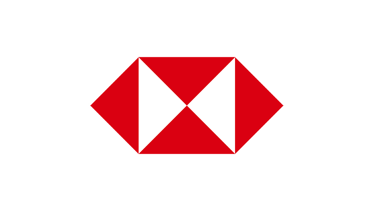
- Contrast in shape and color : This principal is similar to closure and sometimes can work together with it by using the same concept of high contrast color and shapes with some missing forms. But this principle are more to show differences rather than completing what's missing. Example : HSBC logo. From the first glance, its just a simple logo designed from pieces of triangle shapes. After a few moment analyzing it, I realized the contrast, where the shapes were arranged in a structure way, creating a neat yet unique design. But what truly made this logo pop up is the usage of the contrast in color. The combination of red rectangles and white background create an eye-catching visual, making the logo easy to be seen and remembered.

HSBC Logo
Infromation above (Contrast until contrast in shape and color) source (here)
-Emphasis : In this principle, I noticed how certain elements naturally draw the observer's attention by composition. Emphasis isn't just about making something to stand out, but also directing our eyes to focus on to the main part of the design. Some principles such as contrast, scale, whitespace, and movement all work well together in emphasis. For Example, a study I made from an image that shows a row of black chess pawns, but one pawn stands out different with clear and transparent look. This shows the emphasis principle in many ways :
- Emphasis through repetition and disruption : All pawns are arranged in a straight line, creating a pattern. But in the other side, the different pawn with clear and transparent look breaks the consistency, making it the first element I noticed.
- Emphasis through contrast : The differences between the black pawns and the clear transparent one strike contrast to me in color and texture. Make it look different to the others but that's what makes it stands out, guiding my eye to it from the first glance.
- Emphasis through placement : The way the transparent pawn is placed in the middle makes a composition, shows a meaning of importance. The positioning in middle makes both side balance too, which draw my attention naturally.
This observation makes me realized a subtle changes like color, material, and placements, can make a huge impact to a design, making it more interesting.

A row of chess pawns
Information above (Emphasis) source (here)
-Balance : Based on my research balance is always linked to harmony, this principle plays an important role in creating visual appealing and effective compositions. Balance is used to show the visual weight of a design, giving the elements stability and structure. Making sure everything is equal and not overpowering the others. There are 3 primary types of balance :
- Symmetrical balance : Is when elements are placed in same position on both side of a central axis. It don't have to be the exactly same object or elements, but can be similar in way like color, shape, size, or number to create balance in the design. When I learn about symmetrical design, the first thing that comes to my mind is the Titanic movie poster. Where the design feels simple and organized, showing both faces rose and jack set symmetrically on both side. Following with the titanic ship which is also placed in center, aligned perfectly with their faces, makes the composition well-balanced.

Titanic poster
- Asymmetrical Balance : It is different from symmetrical balance, it doesn't mirror each elements on the both sides. Instead, it creates balance through different sizes, positions, and weights of elements to make it look stable but not alike. An example I found is a picture of blue and yellow glass image. From the first I thought it was considered as symmetrical balance, because it is placed in the center and the background is splitted up evenly. But after analyzing it, I realized the colors on both sides are different. The yellow side caught my attention more than the blue side. Its because yellow brings a warmer tone, which is more eye-catching than blue that brings cooler and calmer tone. The light reflection produced from the different environment makes distorted shape. Distorted shape can be seen between the cup and the holder. Not just changes in shape, but also color shifts. The way the light reflects through the water inside cup produce a different color. The yellow background and its orange reflection inside the water blend smoothly because they are similar in hue just different in shades and tone. On the other hand, the blue background color look more contrast because the yellowish reflection cant blend well with blue background make it slightly unbalance. Even though its not symmetrical, the combination of color contrast, light reflection and shape creates a sense of balance.

Blue and yellow glass
- Radial balance : Is a type of balance where elements spread out forming a circle, creating a circular composition from central point. It helps our eyes to focus on the center of the design, making an organized visual. An image I found is color pencils that are arranged forming a circle. From what i see, the first thing that I noticed is how they are placed in a perfect circle neatly, with their tips pointing to the center point. The repetition of pencils with different colors make the composition feel balance and stable. This makes me realize how strong radial balance is to create a focal point.

Color pencils arranged forming a circle
information above (Balance until radial balance) source (here)
-Repetition : A part of design that create a consistent pattern. It's not just all about pattern but also repeating certain color, shapes, or font to make design feel connected. I realized repetition makes a design more recognizable and memorable because we keep seeing similar things or elements. Which can be say as the more u see something, the more u remember it, that's how this principle works. A good example of repetition in design is a stack of books below. The repeating color of the black cover, gold typography, and consistent arrangement creates a luxurious feel composition, makes it easy to be recognized. The consistency brings familiarity to us, makes our brain process what we see quickly and understand the intended message. Suitable for branding, layout design, or visual art.

- Movement with rhythm : This involves the repetition of shapes, lines, colors, creating a motif. The repetition can be structured or irregular. This can be found everyday life which is streetlights along road. The repetition of lights along the road creates a rhythm that guide our eyes along the street, making us understand that the road is continuing.

Streetlights
- Movement with color : Color can also draws our attention. High intensity color or vibrant color can create focal points, while variation use of colors can be translated to depth and motion. For example, a sunset sky. The gradation transition between each color naturally guide our eyes, making it feel like the scene is changing or transformed from time to time. This happen because I realized our eyes follow the color shifts, making it feel like we are following a flow or direction.

Sunset
- Movement with lines : Lines can create movement through their direction and forms, guiding our eye through different paths such as, diagonals, horizontals, zigzags, or curves. This reminds me to a seismometer reading, which is a good example of this principle. From my examination, the lines go up and down creates a movement, where the continuous jagged lines shows the earth vibration, making the image easy to read and active, even without any text and description.

Seismograph
information above (Movement until movement with lines) source (here)


information source (here)
FEEDBACK
- WEEK 1 : Every designer is a design theorist, you need to make your own words to explain it (don't make it look like textbook definition). Make the explanation easy and clear to understand (Imagine how you explain it to someone who don't know or have 0 knowledge about design).
- WEEK 2 : Layout issues on the picture titles and sources (font sizes are too small and hard to read).


:max_bytes(150000):strip_icc():format(webp)/what-are-the-elements-of-art-182704_FINAL-9a30cee7896f4d3a9e078274851d5382.png)
Comments
Post a Comment